2021-05-21
[public] 363K views, 21.7K likes, 728 dislikes audio only
MY PATREON: https://www.patreon.com/BrainCraft
SUBSCRIBE to BrainCraft! 👉 http://ow.ly/rt5IE
Paola's channel: https://www.youtube.com/user/PaolaKBuitrago
Matthew's TED talk: https://www.youtube.com/watch?v=hDYPwelp7js
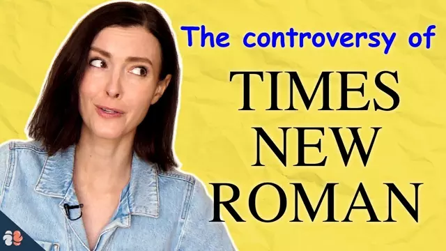
Many claim that Times New Roman is the most readable or accessible font – but is this really true? We dive into font research to explore the accessibility of Arial, Comic Sans, and fonts like Open Dyslexic. Is there one that stands out from the rest? Or is the world of typefaces as subjective as our opinions about design?
My Instagram https://instagram.com/nessyhill
A big thanks to Paola Kassa and Matthew Shifrin for their contributions to this episode.
Created & produced by Vanessa Hill. Edited by Dominique Taylor. Research by Hannah Thomasy
REFERENCES 📚
READABILITY
https://www.ncbi.nlm.nih.gov/pmc/articles/PMC4612630/pdf/nihms729523.pdf
https://psycnet.apa.org/record/2003-10873-003
https://dl.acm.org/doi/10.1145/2858036.2858204
Emotional content and colours:
https://pubmed.ncbi.nlm.nih.gov/18459353/
https://dl.acm.org/doi/abs/10.1145/3132525.3132546
ACCESSIBILITY
https://dl.acm.org/doi/pdf/10.1145/2513383.2513447
https://dl.acm.org/doi/pdf/10.1145/2513383.2513447
https://link.springer.com/content/pdf/10.1007/s11881-017-0154-6.pdf
https://www.tandfonline.com/doi/pdf/10.1080/00220671.2012.736430?needAccess=true
https://www.ncbi.nlm.nih.gov/pmc/articles/PMC5726769/pdf/nihms852548.pdf
Alex Chen’s post: https://medium.com/queer-design-club/the-controversy-of-accessible-type-8def04eb8808
FONT HISTORY
https://www.nypl.org/blog/2014/12/09/times-new-roman
https://www.fonts.com/font/monotype/arial/story
https://www.newyorker.com/magazine/2017/07/31/calibris-scandalous-history
/youtube/video/41i9EN9l8uc?t=40
/youtube/video/41i9EN9l8uc?t=181
/youtube/video/41i9EN9l8uc?t=395
/youtube/video/41i9EN9l8uc?t=457
/youtube/channel/UCt_t6FwNsqr3WWoL6dFqG9w
https://www.patreon.com/BrainCraft
/youtube/video/NkUy2yzaCmQ